两种美化效果如下图:
代码(html)
12使用CSS3美化复选框checkbox
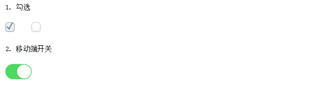
34175111. 勾选
6 7 8 9 1012162. 移动端开关
13 14 15
代码(css)


1 .demo{ width:560px;margin:30px auto 10px auto} 2 .wrap{ margin:30px 0} 3 .wrap p{ padding:10px 0} 4 .chk_1,.chk_2{ display:none;} 5 .top_title{ text-align:center;} 6 7 /*css3选择器:E+F 毗邻元素选择器,匹配所有紧随E元素之后的同级元素F*/ 8 9 /*******STYLE 1*******/10 .chk_1 + label {11 background-color:#FFF;12 border:1px solid #C1CACA;13 box-shadow:0 1px 2px rgba(0, 0, 0, 0.05), inset 0px -15px 10px -12px rgba(0, 0, 0, 0.05);14 padding:9px;15 border-radius:5px;16 display:inline-block;17 position:relative;18 margin-right:30px;19 }20 .chk_1 + label:active {21 box-shadow:0 1px 2px rgba(0,0,0,0.05), inset 0px 1px 3px rgba(0,0,0,0.1);22 }23 .chk_1:checked + label {24 background-color:#ECF2F7;25 border:1px solid #92A1AC;26 color:#243441;27 }28 .chk_1:checked + label:after {29 content:'\2714';30 position:absolute;top:-8px;left:0px;31 color:#758794;32 width:100%;33 text-align:center;34 font-size:20px;35 padding:1px 0 0 0;36 vertical-align:text-top;37 }38 39 40 /*******STYLE 2*******/41 .chk_2 + label {42 width:40px;height:15px;background:#ddd;43 padding:9px;44 border-radius:20px;45 display:inline-block;46 position:relative;47 }48 .chk_2 + label:before {49 content:' ';50 width:31px;height:31px;background:#fff;51 position:absolute;top:1px;left:1px;52 z-index:999;53 border-radius:100px;54 box-shadow:0 3px 1px rgba(0,0,0,0.05), 0 0px 1px rgba(0,0,0,0.3);55 transition:all 0.1s ease-in;56 -webkit-transition:all 0.1s ease-in;57 }58 .chk_2 + label:after {59 content:' ';60 position:absolute;top:0;left:0;61 width:100%;height:100%;62 border-radius:50px;63 box-shadow:inset 0 0 0 0 #eee, 0 0 1px rgba(0,0,0,0.4);64 transition:all 0.1s ease-in;65 -webkit-transition:all 0.1s ease-in;66 }67 .chk_2:checked + label:before {68 left:26px;69 }70 .chk_2:checked + label:after {71 background:#4cda60;72 box-shadow:0 0 1px #4cda60;73 }